Beyond the Click: How Better Pop-Ups Can Strengthen Your Web Maps
August 28, 2026 2026-08-28 7:26

Beyond the Click: How Better Pop-Ups Can Strengthen Your Web Maps
Interactive maps invite people to explore. A reader may begin by looking at the bigger picture, then become curious about a particular location, feature, or pattern. That moment of curiosity presents an important opportunity to provide deeper insight. Web map pop-ups can help make that happen.
Often treated as a simple container for attribute information, pop-ups can actually play a much bigger role in the overall map experience. When designed thoughtfully, they can provide context, clarify complex information, and help transform data into a more engaging story.
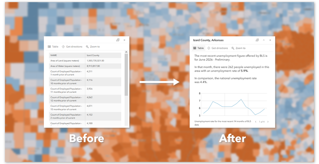
However, a poorly configured pop-up can have the opposite effect. Long tables, technical field names, unnecessary metadata, and too much information can make an otherwise compelling map difficult to explore.
The key is to design pop-ups with the audience and the purpose of the map in mind.
Start With a Purpose
Before configuring a pop-up, ask a simple question: What should someone learn when they click this feature? Not every interactive map needs pop-ups. Sometimes labels, annotations, or supporting narrative can communicate information more effectively.
A pop-up should earn the reader’s click by providing something useful that cannot easily be understood from the map alone. Whether that means explaining a statistic, highlighting a local trend, or revealing information about a specific place, every element should contribute to the overall experience.
Focus on What Matters
Maps can contain a significant amount of data, but readers do not necessarily need to see all of it. Raw attribute tables may include technical information, identification numbers, codes, and other metadata that are useful for managing data but add little value to the person exploring the map.
Instead, think about the information your audience is most likely looking for. For example, if a map shows agricultural production across different counties, a reader might want to know the primary crop, production level, or recent change in output. They are less likely to benefit from seeing internal database fields.
A focused pop-up makes important information easier to find and understand.
Turn Data Into a Conversation
The language used in a pop-up matters. Technical field names and abbreviated values may be familiar to GIS professionals, but they can create barriers for a wider audience. Whenever possible, present information in clear and natural language.
Instead of displaying: POP_DENS: 2,450. Consider presenting the information in a way that immediately communicates meaning: This area has an estimated population density of 2,450 people per square kilometre. The second approach requires less interpretation from the reader and allows the information to become part of the broader narrative.
Pop-ups should feel connected to the voice and purpose of the map rather than appearing as an unedited extract from a database.
Context Gives Data Meaning
A number by itself does not always tell a story. Imagine selecting a county on a map and discovering that its annual rainfall is 800 millimetres. Is that high or low? Has it increased or decreased? How does it compare with neighbouring areas?
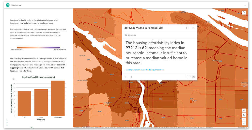
Context helps answer these questions. Pop-ups can be enhanced with comparisons, rankings, thresholds, historical information, and other indicators that help readers understand the significance of what they are seeing.
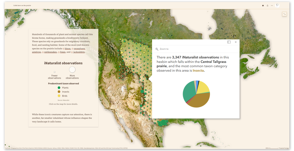
With tools such as Arcade, map creators can further enhance pop-ups by creating dynamic expressions and presenting information that responds to the selected location. Charts, calculations, and comparisons can help turn isolated values into meaningful insights.
Let the Map and Pop-Up Work Together
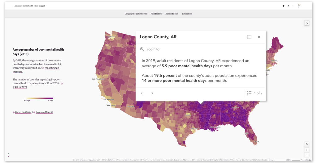
A pop-up should not feel disconnected from the map. The visual language used in the map can also guide the design of the pop-up. Colours, symbols, terminology, and labels can be used consistently to help readers connect what they see on the map with the information presented after they interact with it.
For example, if a map uses a colour gradient to show areas with lower and higher values, the pop-up can reinforce that pattern by using corresponding visual cues. This consistency reduces the effort required to interpret information and creates a more seamless experience.
The goal is not to repeat the map. Instead, the pop-up should complement it by helping explain what the visual patterns mean.
Design for Quick Exploration
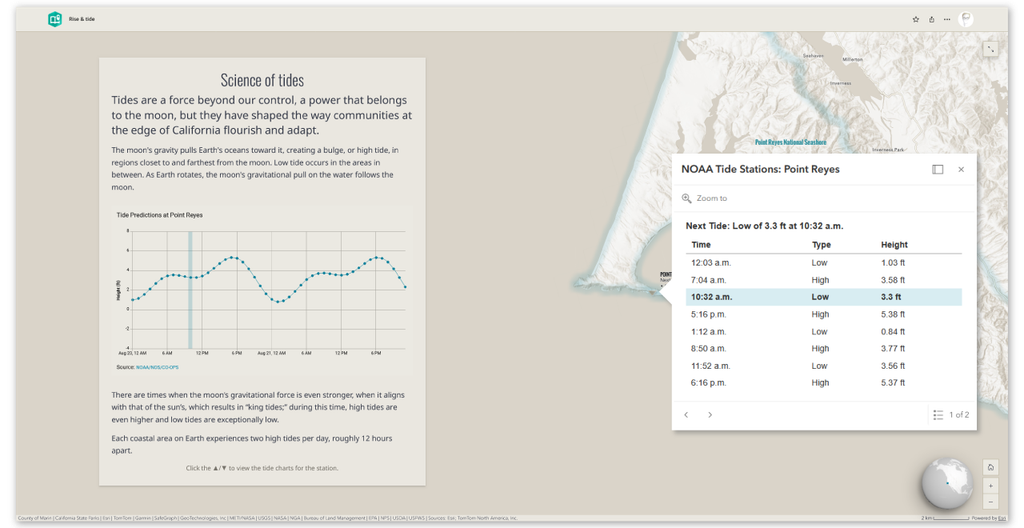
People interact with maps differently from the way they read reports. A pop-up should be easy to scan. Important information should be visible quickly, particularly because screen space can be limited on both desktop and mobile devices.
Consider the order in which information appears.
What should readers see first?
What details are essential?
Which information is useful only after the main message has been understood?
Headings, short descriptions, charts, images, and spacing can all help establish a clear visual hierarchy. When designing pop-ups, remember that simplicity is often an advantage. Providing a few well-organised pieces of information can be more effective than trying to include everything available in the dataset.
Every Click Is an Opportunity
A well-designed web map encourages exploration. Each interaction can help a reader move from simply observing a pattern to understanding what lies behind it. Thoughtful pop-ups support this journey.
They can explain the significance of a location, provide context for a statistic, reveal changes over time, or introduce information that strengthens the overall message of the map.
The most effective pop-ups are not simply collections of data fields. They are carefully designed experiences that anticipate a reader’s curiosity and provide meaningful answers. As you build your next web map, take a moment to look beyond the default configuration.
Ask yourself whether every pop-up is helping your audience understand the story you are trying to tell. With a little intention, a simple click can become an opportunity for discovery—and turn your web map into a more powerful storytelling experience.
Ready to Create More Meaningful Web Maps?
ArcGIS provides powerful tools for designing interactive maps and configuring pop-ups that communicate information clearly and effectively. Whether you are mapping communities, infrastructure, natural resources, business data, or environmental change, thoughtful map design can help transform spatial data into insights that your audience can understand and act upon.
Explore the possibilities and start designing maps that don’t just show information, but help tell its story.