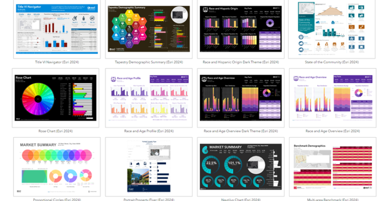
Discover the Infographics Gallery in ArcGIS Business Analyst
August 30, 2025 2025-08-30 12:49Discover the Infographics Gallery in ArcGIS Business Analyst
Discover the Infographics Gallery in ArcGIS Business Analyst
A powerful way to visualize data
ArcGIS Business Analyst offers presentation-ready infographic templates that make it easy to share key insights with different audiences and across industries. You may already know some of the standard templates, like What’s in My Community?, which highlights neighborhood features by civic themes, or Transit Stop Analysis, which helps agencies better understand the populations and destinations served by their stops.
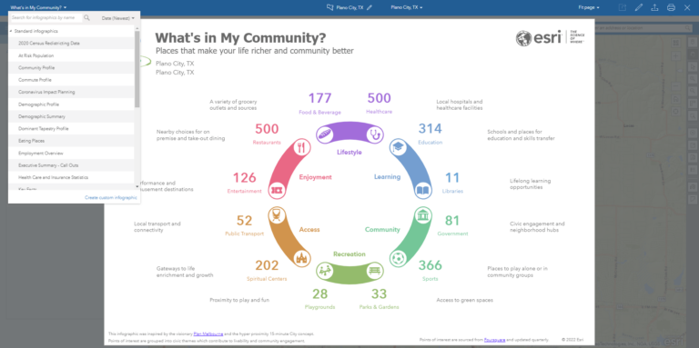
But beyond these familiar tools, Business Analyst also provides a specialized gallery of infographic templates designed to meet more specific goals.

What is the infographics gallery?
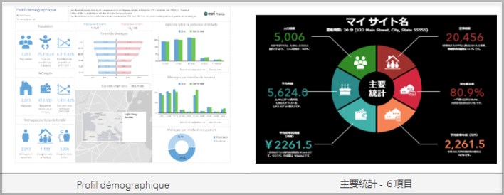
The infographics gallery is a curated collection of templates built for particular datasets, industries, or even countries. Many of these templates are developed by Esri teams (such as Sales and Professional Services) or global partners like Esri Japan and Esri France.
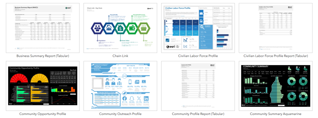
Some templates take the form of tabular infographics—modern, accessible versions of classic reports. Examples include the Business Summary Report (Tabular) and the Community Profile Report (Tabular), which present data in a cleaner and more readable format.
The gallery continues to grow, with new templates added regularly in response to customer needs and feedback.
How do I access gallery templates?
You can explore and run gallery templates directly in the ArcGIS Business Analyst Web App, as well as from other Business Analyst products like the Mobile App, ArcGIS Pro extension, or through the GeoEnrichment API.
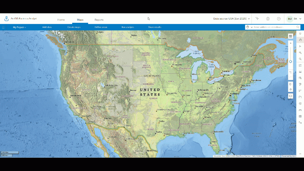
Here’s how to access them in the Web App:
- Go to the Build reports tab and select Build infographics.
- Click the Gallery tab to browse the available templates.
- Open a template, customize it to fit your needs, and save it under My templates for future use.
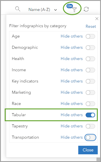
To refine your search, use the Filter option to narrow templates by category, or click Hide others to view a single category at a time.
What data sources are used?
The templates in the gallery are tied to the data source you select and are updated with each new data vintage release. This ensures that your infographics always reflect the most current information available.
Some templates also incorporate premium data sources from Esri’s global partners. The Web App supports six languages—English, French, Japanese, German, Portuguese, and Spanish—automatically adjusting number and currency formats to match your browser settings. More translated versions are being developed, expanding the gallery’s reach worldwide.
What infographics do you need?
The infographics gallery is continually evolving, and your input is a vital part of that growth. We encourage you to share:
- Ideas for new infographic topics that would support your workflows.
- Feedback on existing templates.
- Your own custom templates for possible inclusion in the gallery.
You can provide feedback using the option at the bottom of this article or by posting directly on Esri Community.
The next time you use ArcGIS Business Analyst, explore the infographics gallery to find templates that deliver insights in a clear, visually compelling way—and help us shape what comes next.

